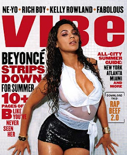
This magazine has used the traditional contrasting colours black and white but have also included in red to make it more appealing and eye catching. The mast-head is in sans-serif in capital red font, this is very appealing as is stands out from the rest of the page, only a Small usage of red has been used so anything in red stands out more than anything written in black, for example the in the cover lines, the heading that stands out the most is "Strips down" and "10+ pages etc". The cover lines on the left are all about Beyonce who is seen in the middle of the magazine, a very beautiful woman who is appealing to men so this hip hop magazine can almost certainly be mainly aimed at men. The Sell line is of just 4 very popular and famous hip hop/R&B artists: Ne-Yo, Rich Boy, Kelly Rowland and Fabolous. these artist are all seen in the same font and style as the title but in black, so it separates it from the master-head.
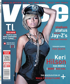
This is another Magazine from the same company, is has used the same font ans style for the Mast-head and Sell line. the colour scheme used is similar, simply the black has been replaced with blue. it uses the same concept of using a single colour to highlight the most important parts in both the mast-head and the cover line, in the cover lines the colour white has been sued to highlight very famous hip hop artists T.I and Jay-z, this helps the magazine catch peoples eye and appeal more to is audience against its competition. this magazine has included a very unique cover line which is a blackberry Friend request bar code, so people can scan this bar code with their blackberry's and will have vibe as a friend on blackberry, this is very good for promotion and advertisement as "Vibe" as a company can then go on a advertise new products and promotions to its audience.
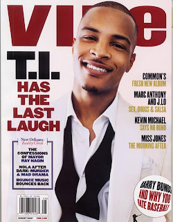
This 'VIBE' magazine like the top 1 has re-introduced the colour scheme of Red, Black and White. but it has also put in touches of gold, this makes the magazine seem as though it has more to offer, as if each colour is something different the magazine has to offer. unlike the other VIBE magazines, this 1 has included the bar code on the front of it, and has not put a sell line on it. there are less cover lines in this magazine, there seems to only be 1 on the left in very large writing, so it seems to be the sub-heading and has a link to the main title. this magazine is published to be about the famous rapper T.I we see him in the centre with his name next to him in the cover line on the left, this immediately help the audience identify him and attracts potential customers. his clothes almost seem to disappear into the back ground, the white is very similar but the black untied bow tie which adds conflicts in the colour and makes it stand out more.
This Vibe magazine has a strict colour scheme through out, it uses yellow, white and black. The mast-head is the same as it is in all Vibe magazine, at the top going across the whole page in the colour that stands out the most, in this instance it is in white. The image is in the centre of the page and like in many other Vibe magazines the black clothes the artist 'Drake' is wearing is the same as the black background,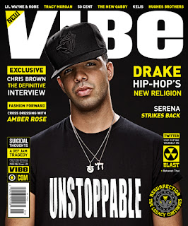 so it makes the magazine and the picture come together as one. The writing on the Artists top that says 'Unstoppable' in capitals is very eye catching and promotes the artist. the cover lines are in yellow and white, these 2 bright colour go together so it makes them stick out a lot compared to the black background, so if seen on a shelf amongst competing magazines, this edition would be extremely eye catching. the bar code is vertically in a box on the bottom left along with other writing which seems to be extra cover lines which would appeal to a small minority of its target audience, they have put this too the side so the magazine doesn't have a contrasting target audience therefore the main target audience can be targeted.
 so it makes the magazine and the picture come together as one. The writing on the Artists top that says 'Unstoppable' in capitals is very eye catching and promotes the artist. the cover lines are in yellow and white, these 2 bright colour go together so it makes them stick out a lot compared to the black background, so if seen on a shelf amongst competing magazines, this edition would be extremely eye catching. the bar code is vertically in a box on the bottom left along with other writing which seems to be extra cover lines which would appeal to a small minority of its target audience, they have put this too the side so the magazine doesn't have a contrasting target audience therefore the main target audience can be targeted.
No comments:
Post a Comment